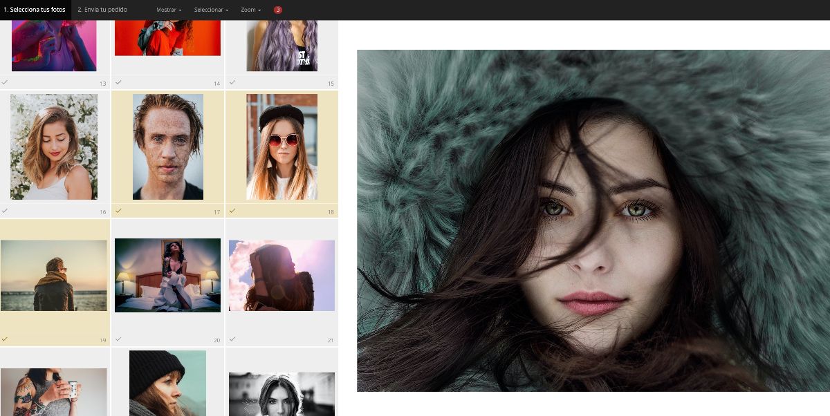
A common question among photographers who create their website with Bluekea is the size their photos should be when preparing them to upload to the web. We will try to clarify this matter based on the display modes in Bluekea, but these are general tips that apply to any type of website.
Table of Contents
In Bluekea, and other web platforms, we can talk about three modes of photo display: full screen, embedded in the content, and floating.
1. Full screen photos
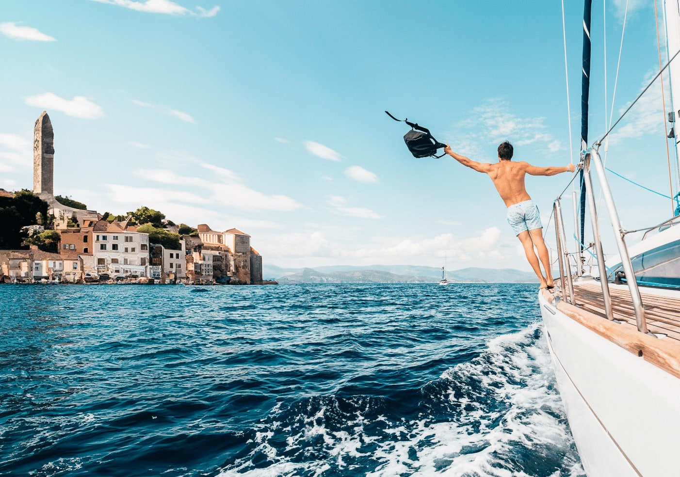
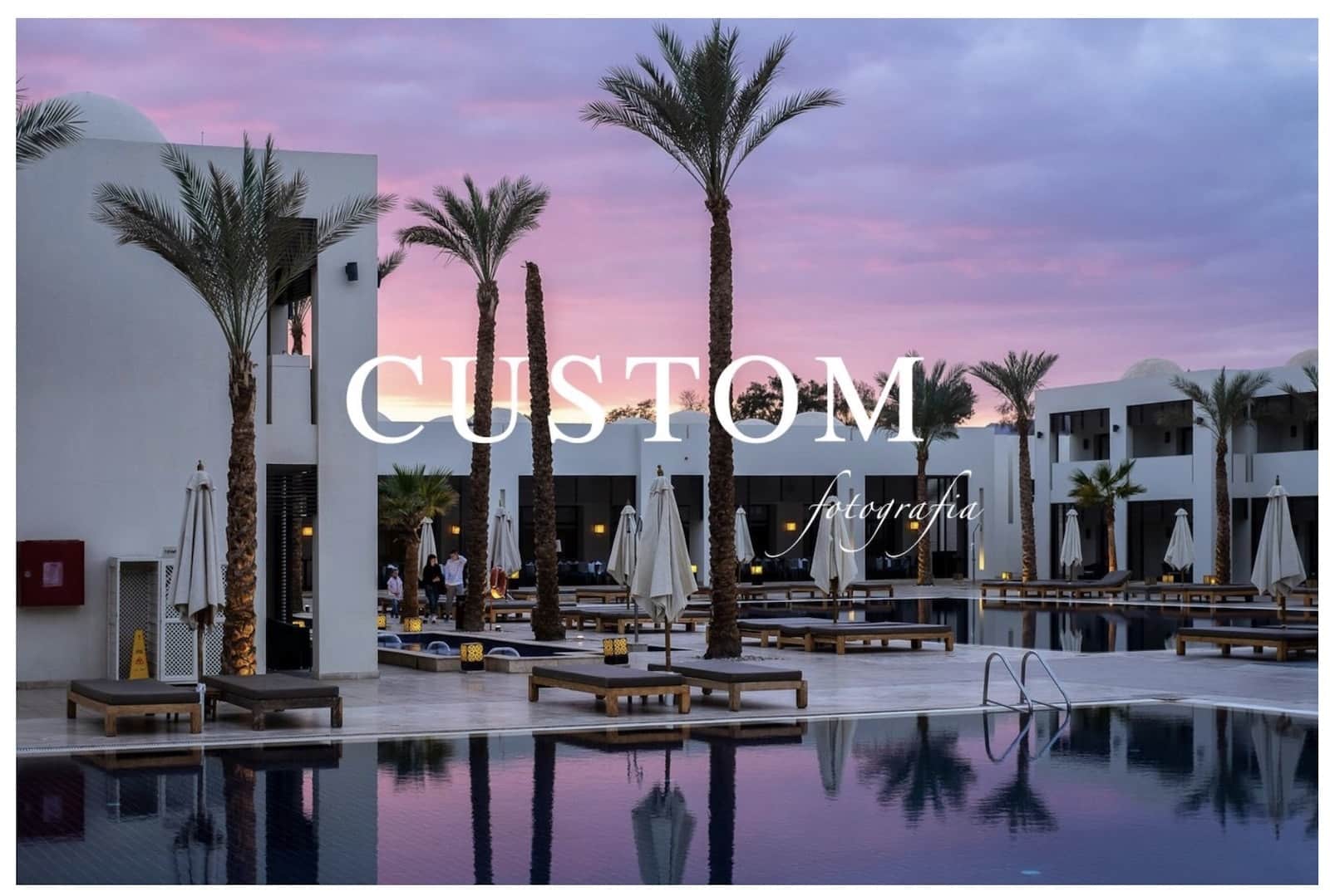
These are the images that take up the entire browser area, as is often the case on the homepage, or they are the main photos (also called “hero” images) that span the full width of the screen and often have an overlayed headline.
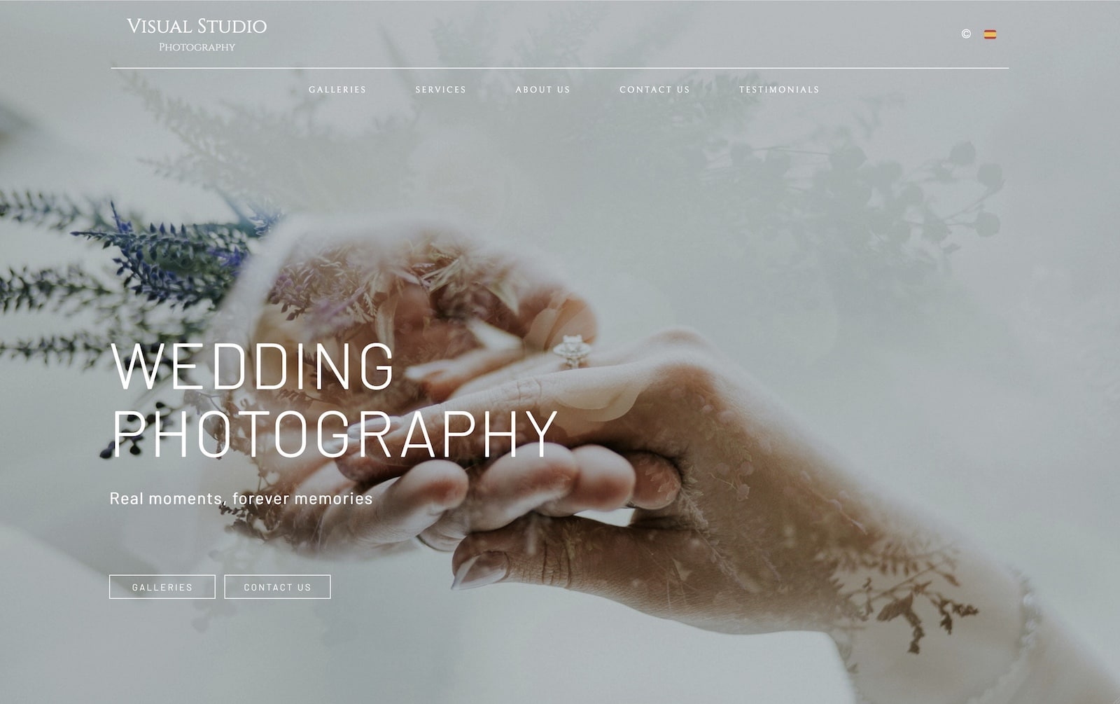
To achieve good quality on computer or tablet screens, the recommended size for these types of photos is about 2,100 pixels wide.
For mobile devices, it is ideal to have the option to upload a vertical version of the same photo or a different one that is shown only on mobile. This is something Bluekea offers for homepage photos. In this case, for vertical photos, we recommend about 1,050 pixels in height.
2. Photos embedded in the content
These are the photos that appear within the framework of the website itself and share space with text, menus, or other elements. In Bluekea, these photos correspond to galleries with the “embedded” display mode and images within content modules, which are combined with text, headlines, or buttons.
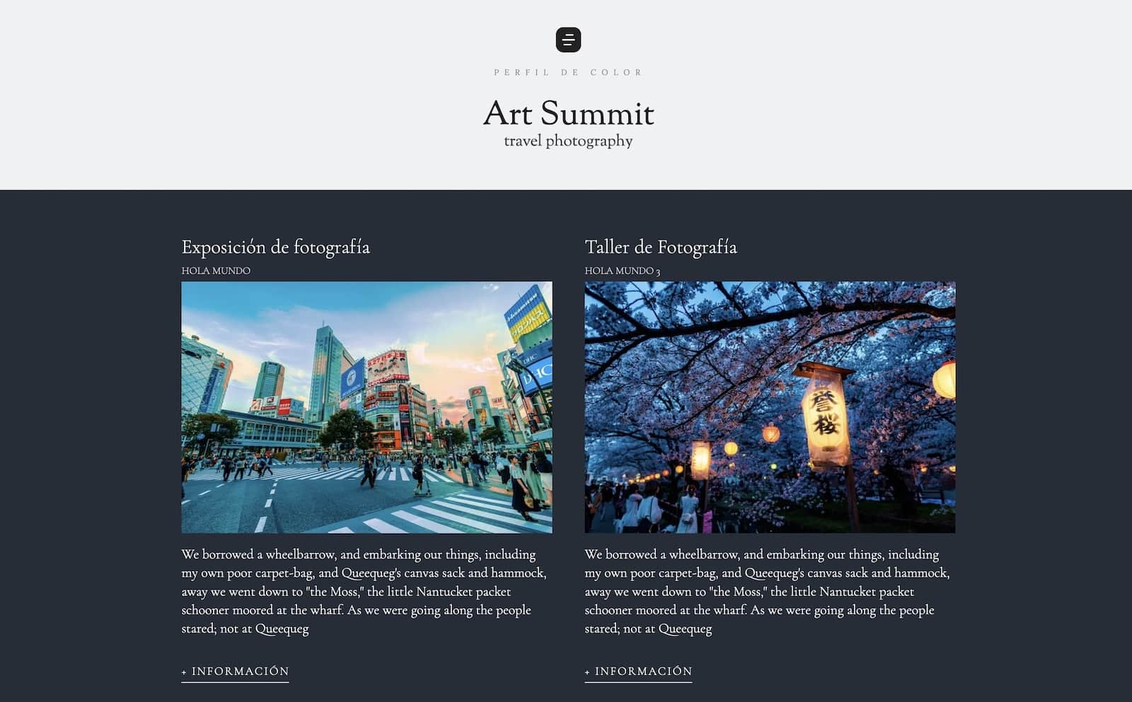
In these cases, where the photo occupies only a part of the screen, we recommend a size between 800 and 1,200 pixels on the larger side (height if the photo is vertical and width if it is horizontal or square), depending on the relative size each image occupies.
If your website is well-designed to adapt to any screen, these sizes are suitable for desktop, mobile, or tablet.
3. Floating photos
We call floating photos those that are displayed as a pop-up window, above the rest of the content.
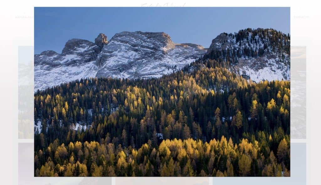
For this type of image, the size should be relatively large. As a reference, we recommend a maximum width of 1,900 pixels and a maximum height of 1,050 pixels.
4. Additional considerations
Format and compression level
Currently, the most widely used format and the one we recommend for your website is JPG. That said, many websites, including those of Bluekea, use more advanced formats like WebP, which is generated from the uploaded JPG.
We recommend a compression level for JPG files between 70% and 75%, which allows you to maintain almost all of the photo’s quality without making the file too heavy.
If you use Adobe Lightroom to prepare your photos for the web, here’s how to export them optimally.
Color space
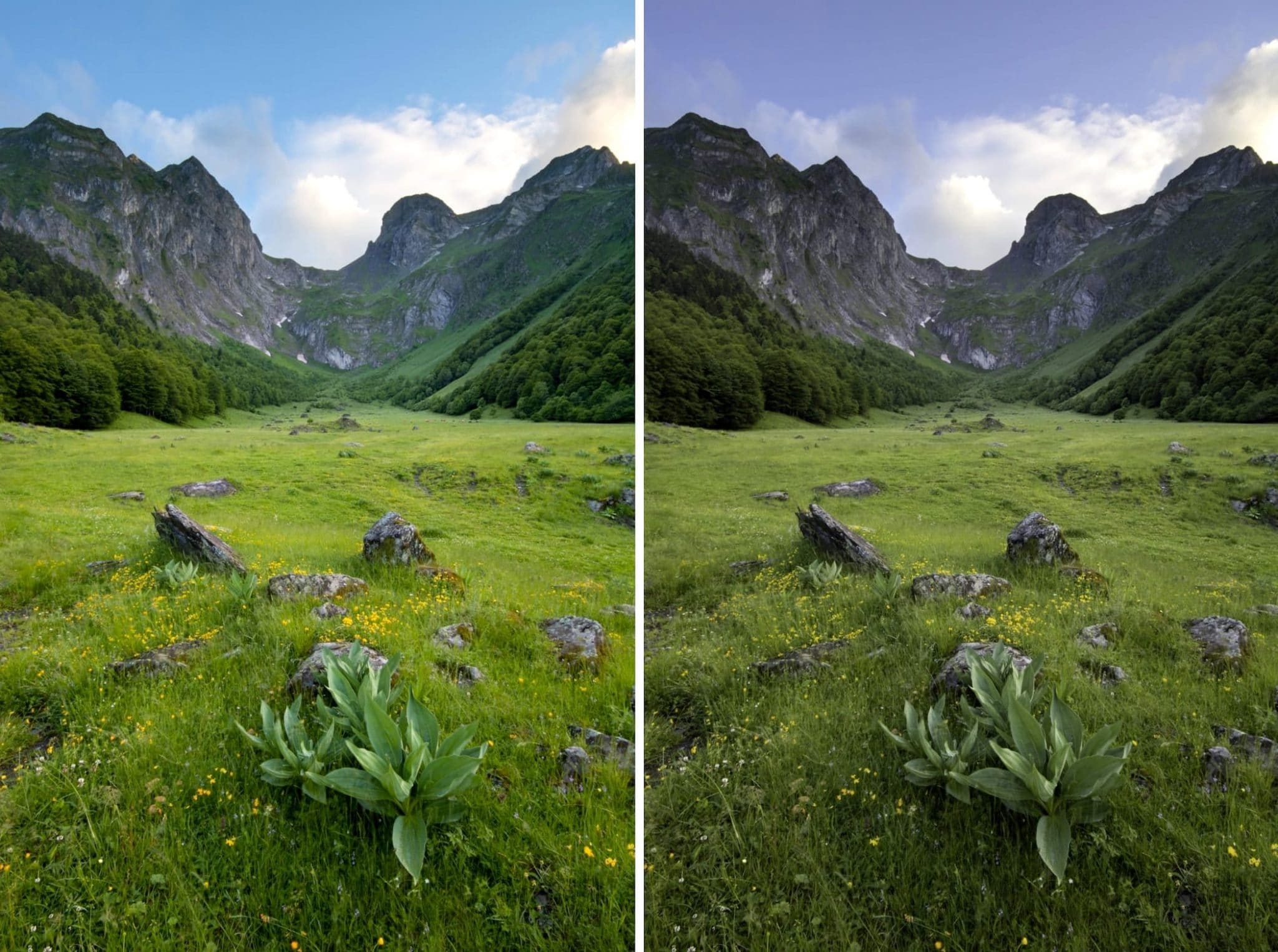
The color space we recommend for web photos, as it guarantees the best color fidelity, is sRGB. In fact, if your photos appear with dull colors and lack contrast, it’s likely that the problem lies in the color space selected when creating the JPG files.
If you would like more information on color spaces, check out this article.
Resolution
This factor is not important at all. Resolution in pixels per inch (PPI) is irrelevant when preparing photos for the web. It does not affect the quality or sharpness of images on screen, and should only be considered when producing physical copies in print or other physical formats.
Upload your photos at their optimal size, not larger
When a medium or small-sized photo is needed, many websites create a reduced version from the original image to optimize loading times. This is also commonly done if the uploaded photo is excessively large, exceeding what is necessary, even for full-screen images.
It is always recommended to upload photos at the maximum size they will be displayed, but not larger. If we upload very large photos, our website will typically resize them to a smaller size. This way, we won’t gain any quality, it will take longer to upload, and we will lose control over the final image displayed.
A world of screens
Photographers often work with very large monitors, ranging from 21 to 27 inches, with high resolutions. However, this is the exception rather than the rule for the average website visitor.
In recent years, laptops have been the best-selling type of computer, and many websites receive more visits from mobile devices than any other platform. Mobile phones, tablets, and many computers now have high-resolution screens, which require larger photos to maintain good quality.
From all this, we deduce that it is very difficult to establish a standard browser size that would allow us to prepare our photos accordingly. To help with this, we can refer to the website statcounter.com, which provides statistics on screen resolutions in various regions around the world. At the time of writing this article, here are the results:
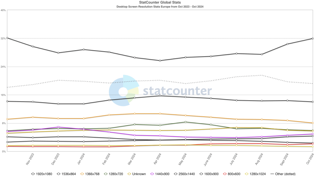
In conclusion, we should not rely solely on our photos looking good on a single device or screen.
The future
The constant improvement of technology and the gradual increase in available bandwidth lead us to a scenario with increasingly powerful devices, powered by high speeds through fiber optics and 5G. This will allow us to display our photos in large sizes and high quality.
However, not all of our visitors will always have the latest technology, nor can we know what type of device or screen size they are using. For all these reasons, it is advisable to always stick to optimal sizes, as we have explained here.


