Let’s look at some essential aspects of web design such as color, typography, text, and the arrangement of elements, which will help you achieve a more current and professional presentation.
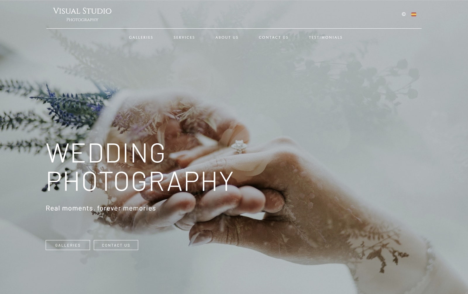
1. The Homepage
The homepage is the showcase of your website and often determines whether a visitor stays or leaves.
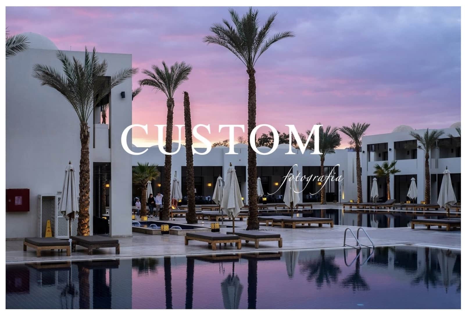
It is important to clearly and immediately convey what you offer. You can use a homepage with a slogan, or a simpler one if your logo already contains that information.
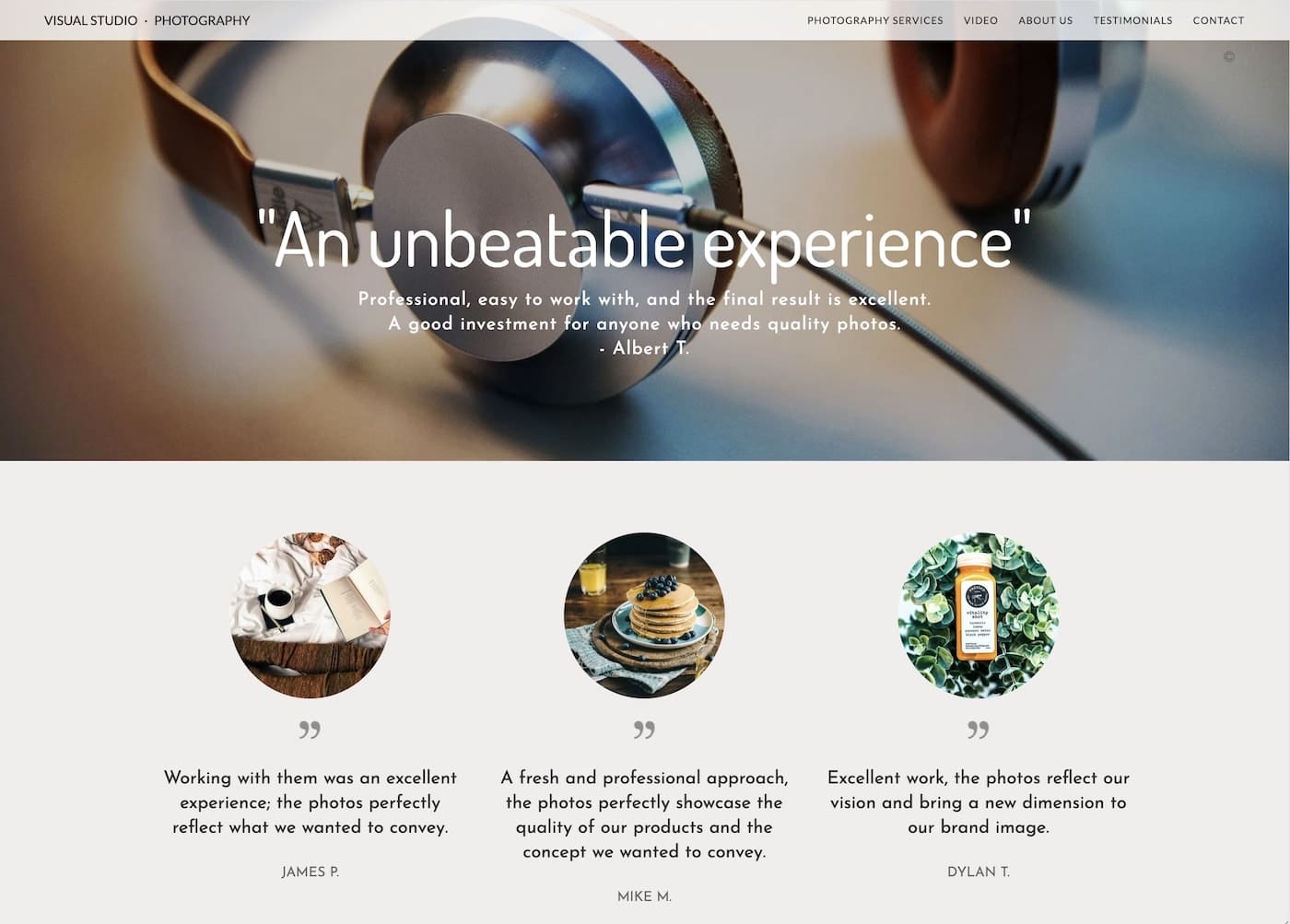
Images are essential; they should showcase your best work and be of good quality and sharpness.
If you include text or headlines, ensure they display correctly on mobile screens. You may need to adjust the text length.
If you use background photos, there should be adequate contrast between the text and the images; if your text is white, the images should not be too bright. You can also adjust the opacity of the background to improve contrast.
2. Visual Balance
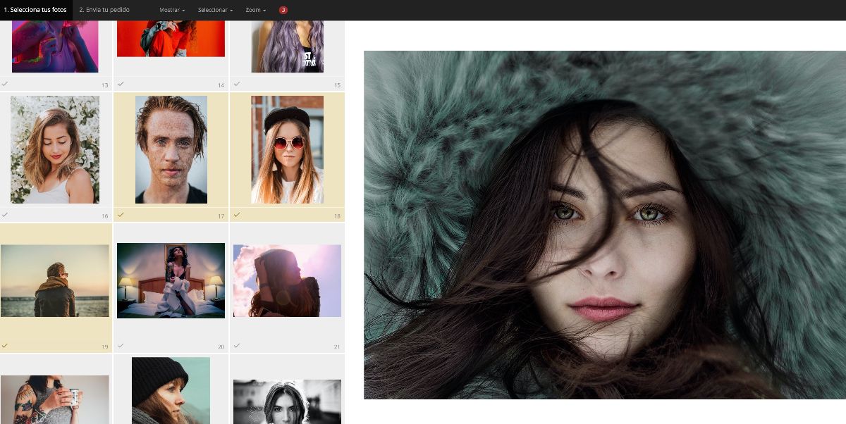
We should avoid pages with multiple elements that result in incomplete rows or empty spaces as much as possible. In Bluekea websites, both modules and galleries have size options that we can use to achieve this. For example, in a gallery with 12 photos, we will choose a thumbnail size that results in 4 rows of 3 photos, or 3 rows of 4. When the number of elements does not allow for complete rows, we will try to get as close as possible.
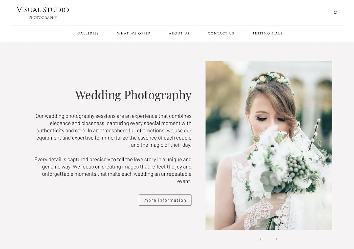
In multi-column content that combines text and images, we will try to ensure that the texts and titles are of similar size in all elements.
On the other hand, it is important to avoid text that is too small or too large. To differentiate headlines from each other and from normal text, we can play with spacing and formatting (bold). You have an example in this very text you are reading.
3. Color
It is important to avoid colors that are too strong or saturated, especially in backgrounds. If you like light backgrounds, white is a safe bet, but there are others that work very well too, such as brown/beige or blues, always in light pastel tones. You can also use a light gray with a neutral, warm, or cool tone.
For a dark background, pure black can be too strong; you can use a very dark gray or dark, low-saturation tones of blue and green instead.
Remember that the text should always be clearly visible against the background. Avoid text colors that are too subtle with low contrast.
4. Typography
Typography is one of the most important elements in the design of your website, and it rarely gets the attention it deserves.
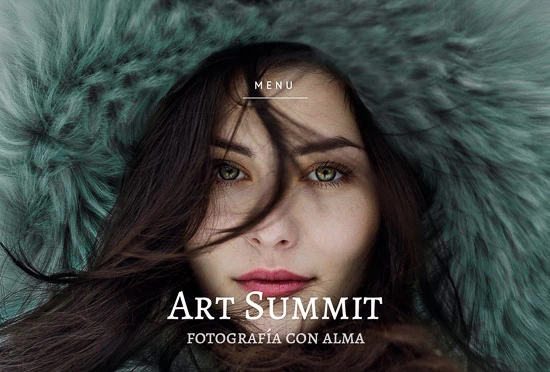
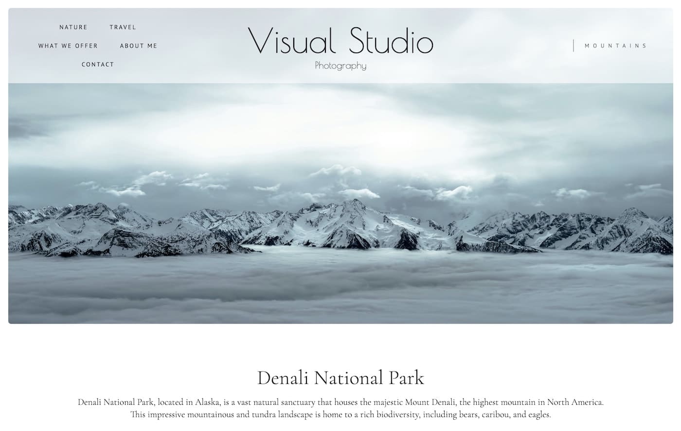
The typography of the headlines should reflect your work and what you offer on the website. If you do wedding photography, you can use a more elegant font; if it’s photos of children or family, it can be more casual.
In general, we recommend using two distinct typographies: one for headlines and another for the general text. Pairs of serif (with strokes at the ends of the letters) and sans-serif (without them) types usually work well. An example is this article you are reading, where the headline is serif and this text is sans-serif.
The typography should be consistent throughout the website to facilitate navigation.
5. Texts: Space, Contrast, and Size
In this very article, you can see how all these tips are applied in practice: we see a main title followed by three sections with highlighted titles. The titles, paragraphs, and separations visually organize the content and facilitate reading.
Space
Our texts should have an adequate structure and hierarchy. We must avoid large blocks of uniform text; generally, our visitor will be looking for specific information (a price, a service) and we need to make it easy for them.
It is advisable to divide the content into paragraphs and avoid redundant or complicated texts. The spacing should be consistent with the content hierarchy; for example, the space between a block and its title should be slightly less than that between a block and the title of the next one.
Contrast
It is important that your texts are easy to read, and for this, it is necessary for the text color and background color to be well differentiated. We must avoid colors that are too subtle. In addition to facilitating the reading of the content and improving the visitor’s experience, we will also avoid penalties in search engine results, which also take into account the contrast of the text with the background.
Size
While we will avoid large size changes within the text, it is recommended that the size of the headlines relative to the text corresponds to the importance of the title. That is, the title of a page should be larger than that of a section within that page.
6. The Logo
If you’re uploading your own logo image to the web, make sure it doesn’t have empty space around it—the image’s edge should align closely with the edge of the logo itself. This helps you make the most of the available space, since extra margins reduce the logo’s effective size.
If you can choose from several logo formats or create one specifically for the web, keep the following in mind:
- The logo should look good at small sizes—if it’s complex or highly detailed, those details will be lost when it’s scaled down for the web.
- Horizontal logos work better on websites than square-shaped ones.
- Logos that include text look better when the text takes up a significant portion of the total space.
You might also like

An introduction to Photoshop AI: how to change backgrounds, remove elements, and extend images
learn more